I totally agree with you about being able to identify many of the symbols; they are certainly pictograms, like many writing systems at their beginnings. And I certainly saw one as the Enterprise…
But I disagree about that being a bad thing; I expect it to be something that will serve as a memory aid in a way that the Bamum symbols won’t. Especially if, for some reason, you want to tell someone else which key to press (though I don’t think that’s of any great importance).
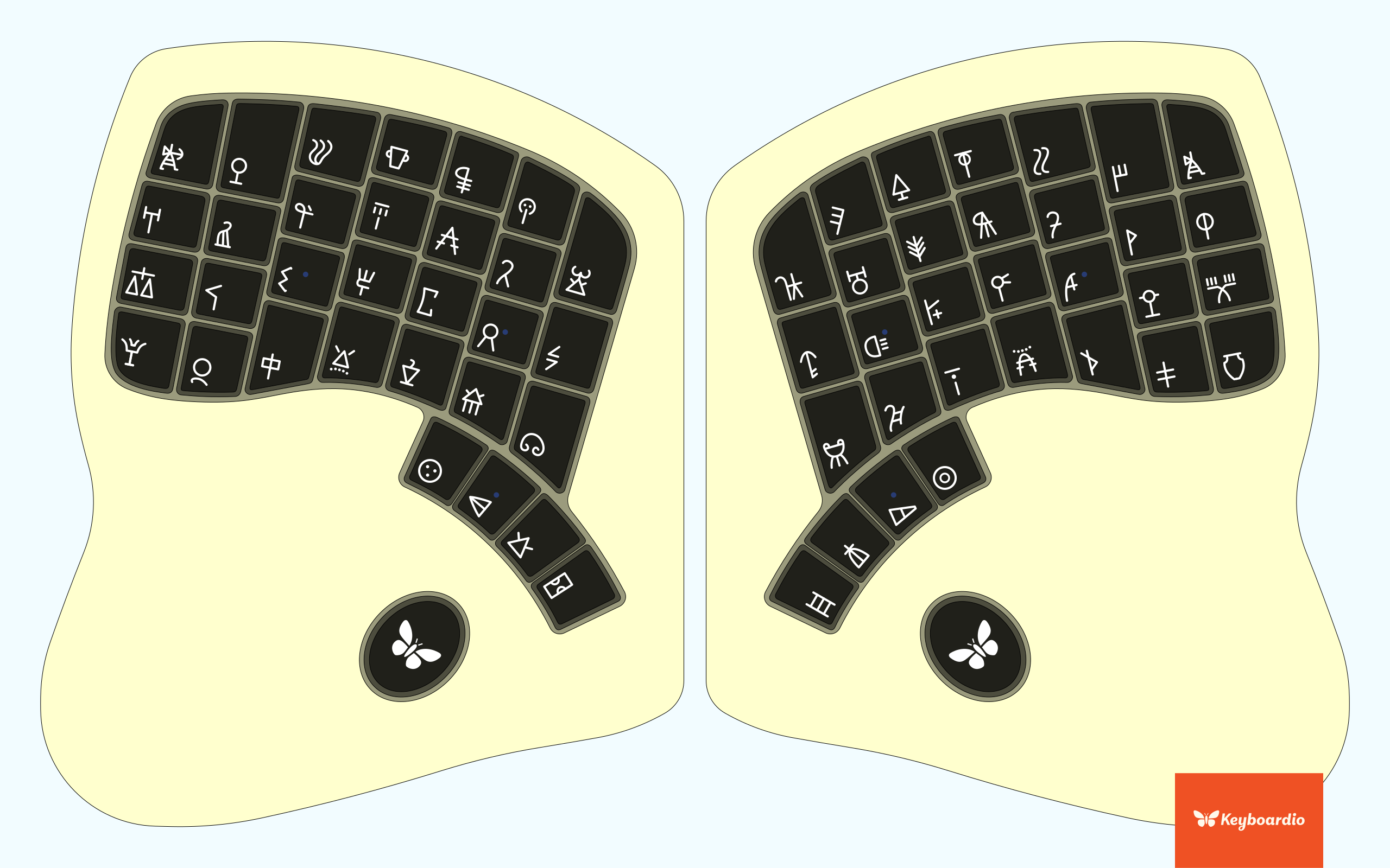
Does anyone know where all the homing bumps will be? I’m wondering both about which keys they’ll be on, and where exactly on those keys, since we need to avoid them with whatever symbols get printed.
I love your overlay of the names for the hieros. I thought the same of many of them but some of yours are straight out hilarious.
I see a bullseye but a donut works just as well. My favorites are: wifi, dinosaur, angry parking meter, stealth bomber, bird bath, turnip, flux capacitor, pat on head, ice hockey team logo.
I added homing bumps (they’re subtle, but you can see them if you look closely). I’m now thinking that the symbols in this mockup are too big, but I’m not sure. Scaling them down is fairly easy, in any case.
I’ll try to add Mende tomorrow; it’s too late to do any more of this tonight. Here’s the SVG with both sets of symbols, if anyone wants to play with it (or just have a quick way of switching symbol sets).
All three runic candidates can be found in the same SVG now. If you use Inkscape, the symbols are in different layers; just make the one you want to look at visible, and hide the others.
These all look awesome, @merlin! Thanks a ton for all the work you put into updating all of them! I’ll be putting the new images into the poll in about an hour, as soon as I get into work.
Thank you, @merlin, for the beautiful images — and thanks to you, @algernon, for all your work with the polling. I’m so impressed with (and grateful for) the high-quality time and effort that people are donating to the many aspects of this project.
I love the other two, but the indecipherability of Linear A won me over for the purpose of a set of decorative nonsense symbols.
I would prefer if the human-like glyphs were replaced, however. I think they trigger a pictographic search for meaning. “Archer,” and “Shepherd,” in particular both trigger this and give a more ancient feel; absent such images, there’s a lost in time aspect to many of the symbols.
If people generally want to replace any symbols, I’m happy to do so. I’m rather fond of those two, myself, but there are certainly others that I’d be fine with, as well. Many of the Linear A symbols are ideograms, so if that’s what gets chosen, we’re sure to have a few that look like a picture of something, but there are plenty of options for minimizing the number that people dislike.


